Glock

A poorly-designed logo for a local locksmith? No. It’s the official logo of one of the world’s most famous sidearms. Glock.
Handrail
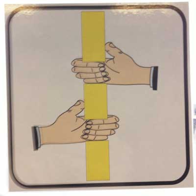
A notice on a German airport bus. Designed by someone who has never seen a hand. Or a handrail.
Cow
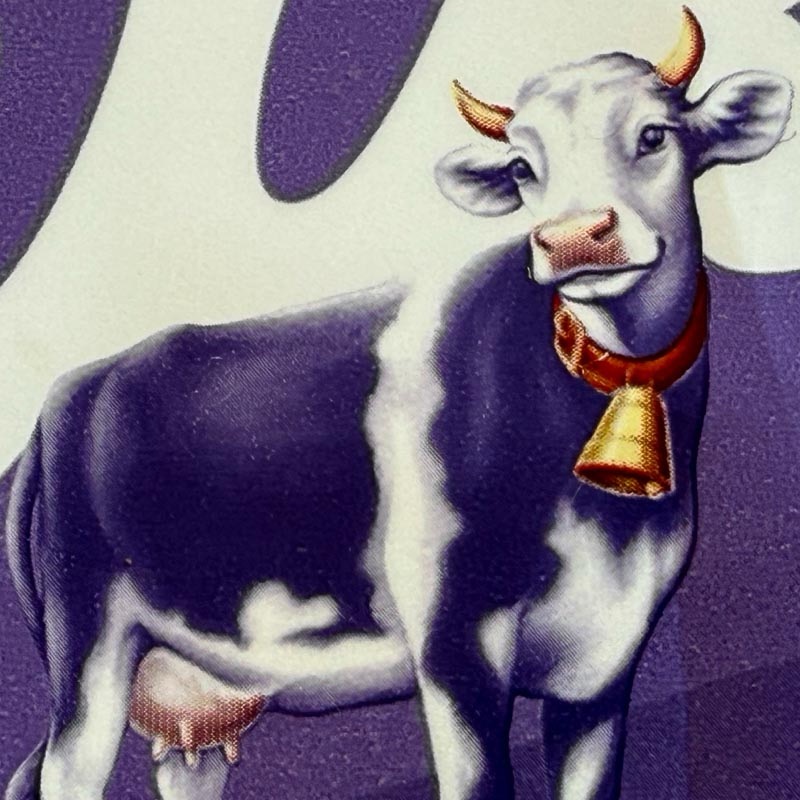
Wrapper for Milka chocolate. Is it my imagination, or is that cow flirting with me?
Memorial
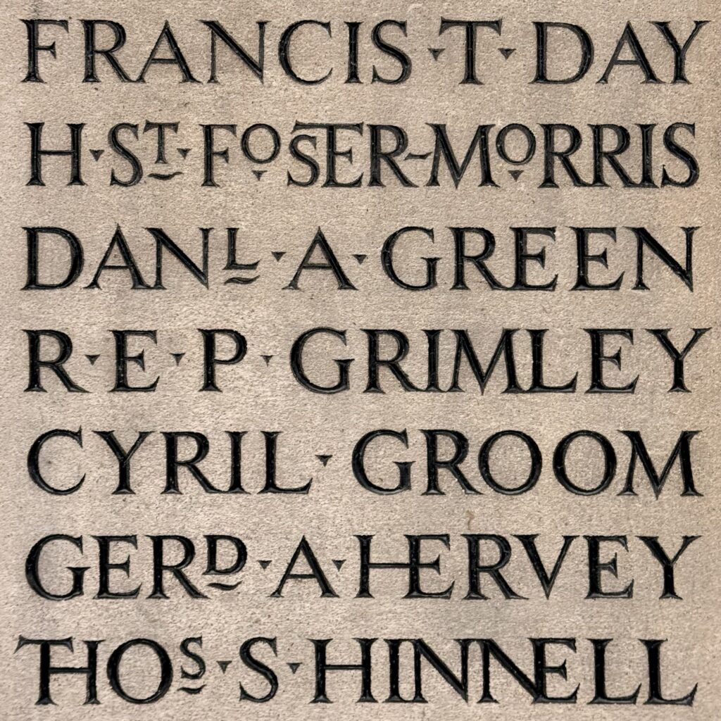
A First World War memorial in Bury St Edmunds cathedral. They’d never take such liberties with the typography today.
Estates
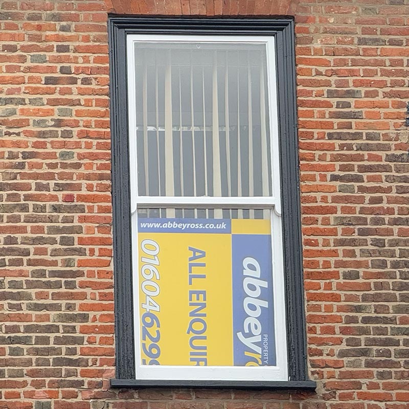
Good to see an estate agent really pulling out all the stops to sell their property
Ford
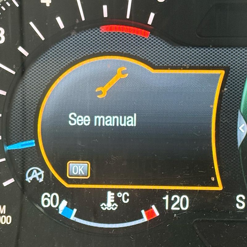
Thanks, Mr Ford, that’s really helpful. Happen to know the page number?
Departures
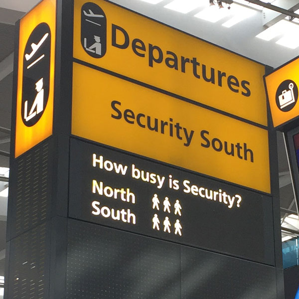
How busy? Three. That’s how busy. Out of how many?
Sauna
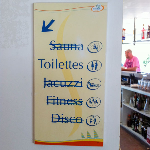
Not worth going to the trouble of getting a new sign made
Odeon
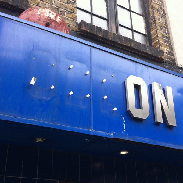
The cinema that cares
Pepperoni
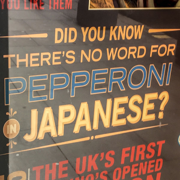
Er… there’s no word for Pepperoni in English either
Brett
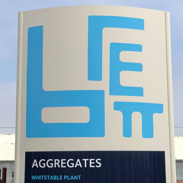
Hideous logo? Maybe, but all the elements can be rearranged into a rectangle! Cool, huh? Huh?
Luxury home
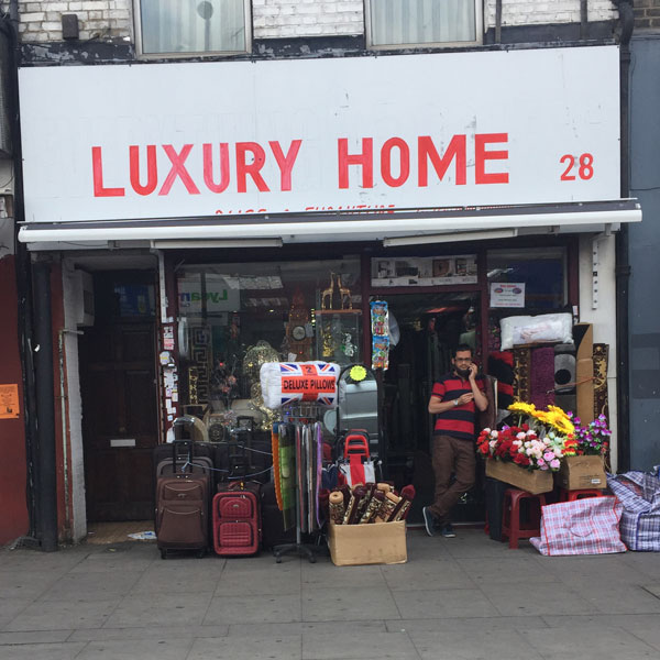
A whole new meaning of “luxury”
les gentlemen
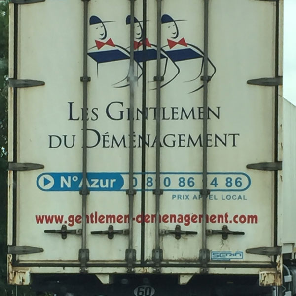
I’d phone them up, if I knew their phone number
knife
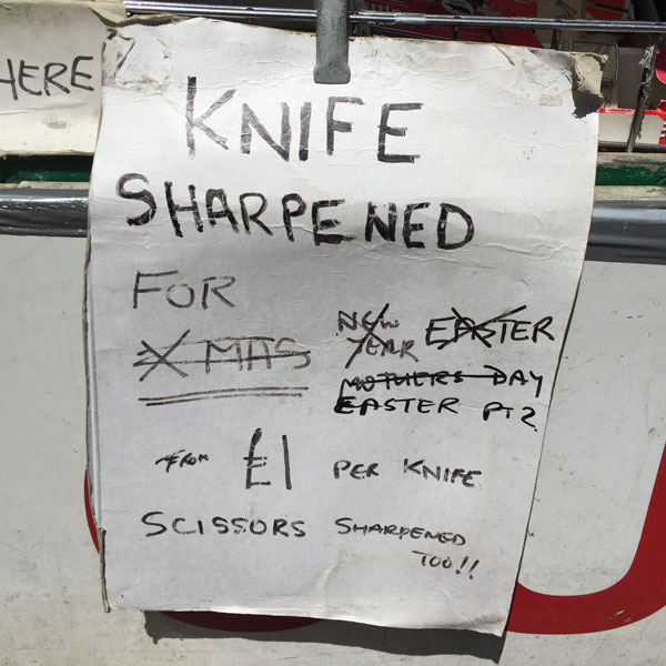
Clearly wasn’t worth going to the trouble of making a whole new sign
cardiac
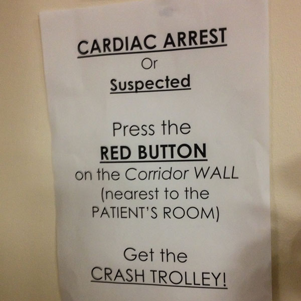
Bold! Underlined! Italics! Capitals! Must be serious.
rid is hot
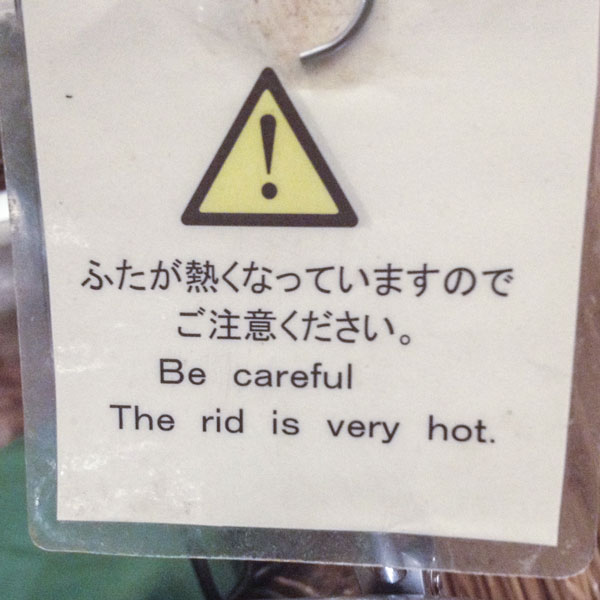
Sign in hotel in Tokyo
signwriting
Too many messages, not enough space
pound shop
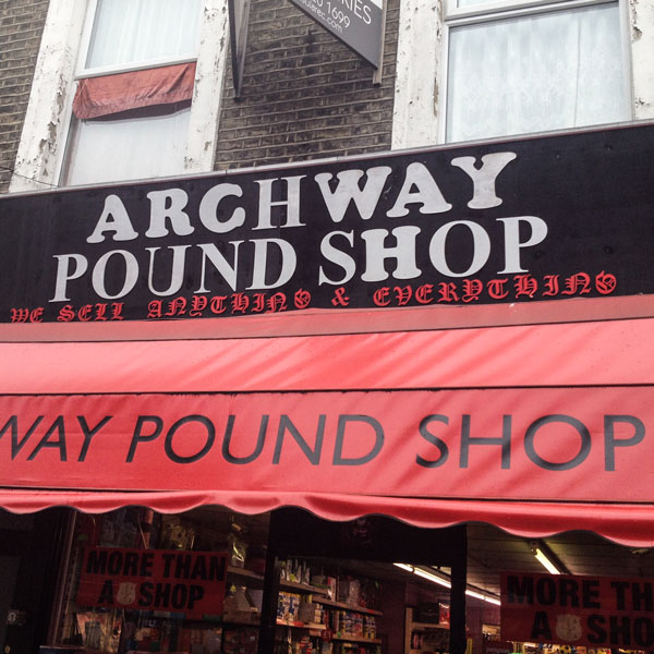
No expense spared on signage
ADEF
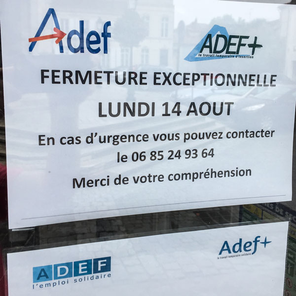
One company, three logos
message
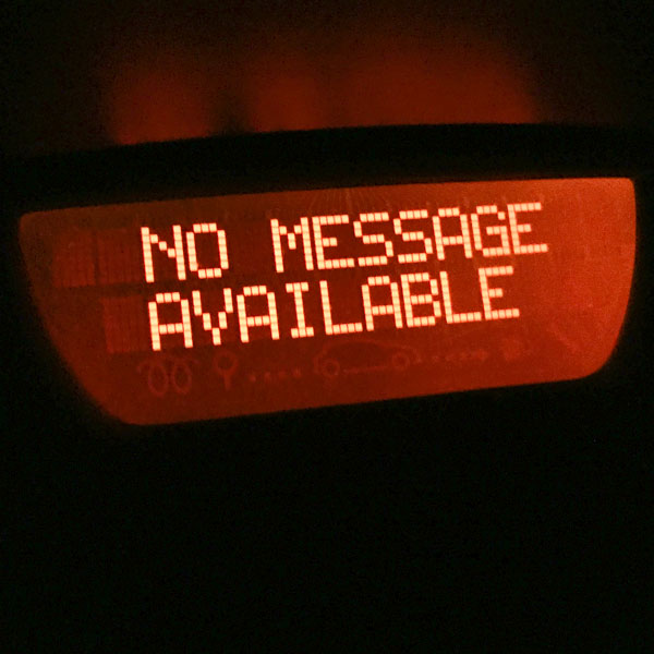
A helpful message in a rental car.
Plaza de Armas
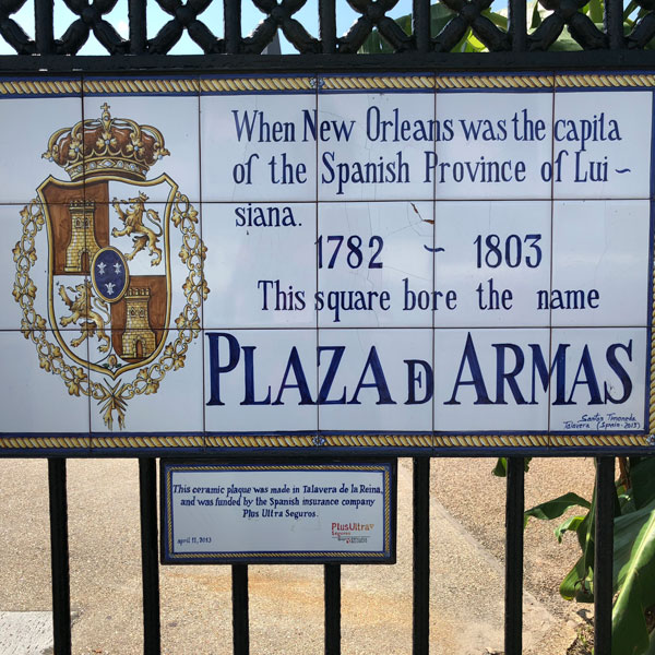
The spacing is hideous, but the hyphenation of Luisiana is unforgivable.
Worship
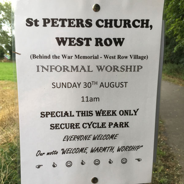
Look how many fonts I have! I’m going to use them all!
DIY time
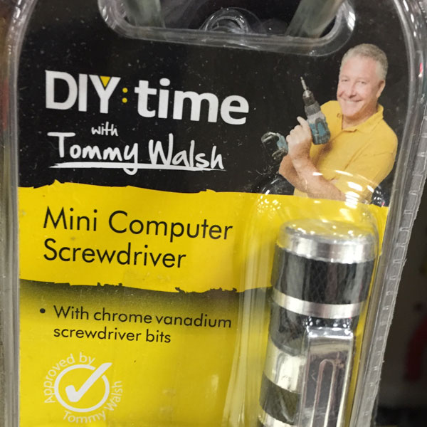
I’d trust cheeky chappie Tommy Walsh to tile my bathroom. But I wouldn’t let him anywhere near my computer.
Concept
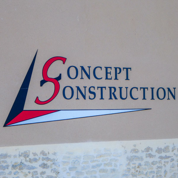
Yes, I can sort of see what they’re doing. But that’s definitely a capital S.
Max waiting
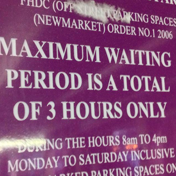
Do “total” and “only” serve any purpose here?
Printer error
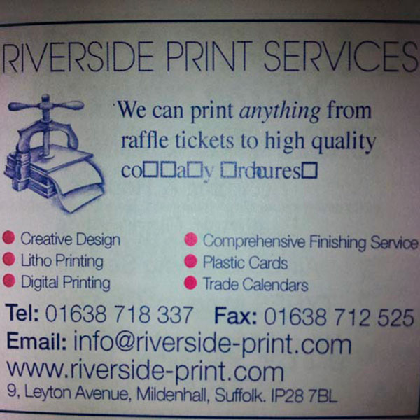
The really funny thing is that this is the printer who printed this programme.
Professional builders
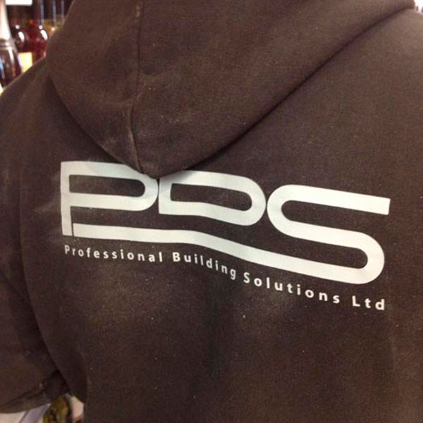
Ah yes… PDS, the logo of Professional Duilding Solutions Ltd.
No sign boards
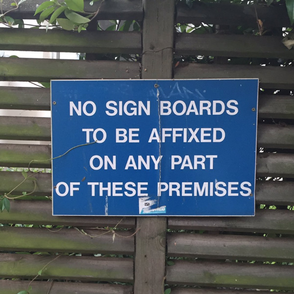
No sign boards? Really? Not even this one?
A design too far
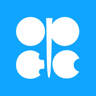
The logo for OPEC, the Organisation of Petroleum Exporting Countries. Hard to imagine it being any uglier.
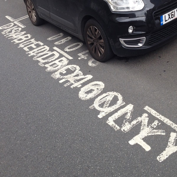
Which way?
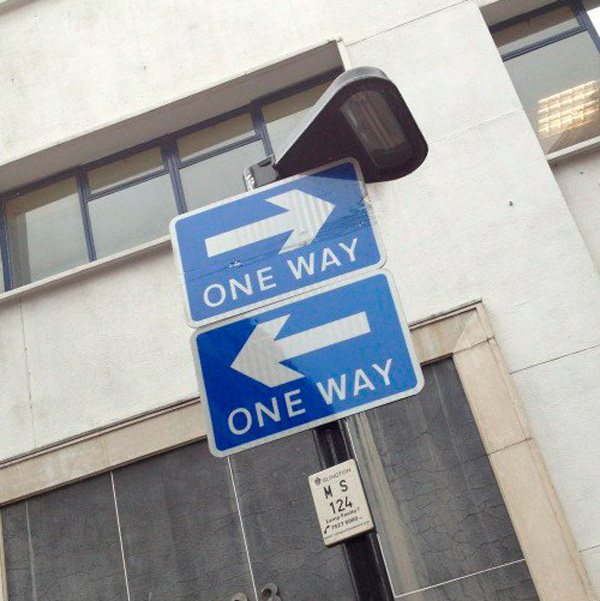
A helpful road sign.
Every story needs a picture

But some pictures are just wrong. A better way to keep your brain healthy would be to keep it inside your head.
Watch your headlines
Sometimes it really pays to check how your content works on mobile.