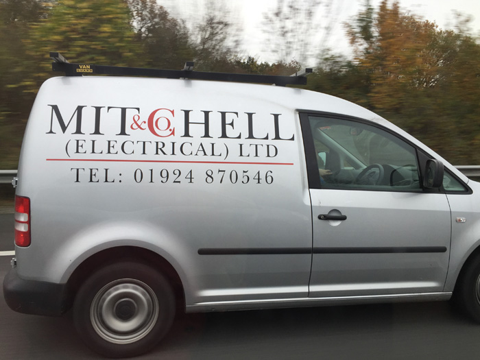
MUCH AS I’D LIKE to admire the logo for electrical contractor Mitchell & Co – after all, it’s not often an independent electrician goes to the trouble of creating his own logo – I can’t help feeling that this is trying just that bit too hard.
It’s a cute idea, and it very nearly works. Perhaps, with a smaller ampersand and consistent letter spacing, and if they lost the full stop after Co, it might just have got there… but as it stands, it’s a near miss.


