NEWSPAPER SUBEDITORS GO TO GREAT LENGTHS to make headlines fit the page. This isn’t a recent innovation – it’s been happening since the beginning of commercial printing. This poster board from the Evening News of 1911 features four decks of headline, all exactly the same width.
OK, it’s not perfect from a typographic point of view, and the mashup of fonts and weights wouldn’t go down well today. But with only a set number of font sizes to choose from, it’s an astonishingly precise piece of work.
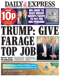
Every newspaper strives to make their headlines fill the space as tightly as possible. To take a front page almost at random, look at this recent edition of the Daily Express. The headline wraps itself around the image, the words chosen to fit the space precisely (although there is too much space between TOP and JOB, which pushes the second word uncomfortably close to the picture).
The real masters of headline fitting, though, were not on a newspaper, but on BBC Ceefax. Limited to just 35 monospaced characters – exactly 35 characters – the subeditors had to write headline after headline, day after day, that fit the space exactly.
By any standards, it’s mind-boggling that they should be able to do this, while still producing a headline that doesn’t look forced. Sometimes the phrasing is a little awkward – the word “combed” in the third headline from the bottom is a less comfortable choice than “searched”, but the word is two letters shorter.
The really amazing thing, though, is that apart from the odd designer, no-one really noticed.