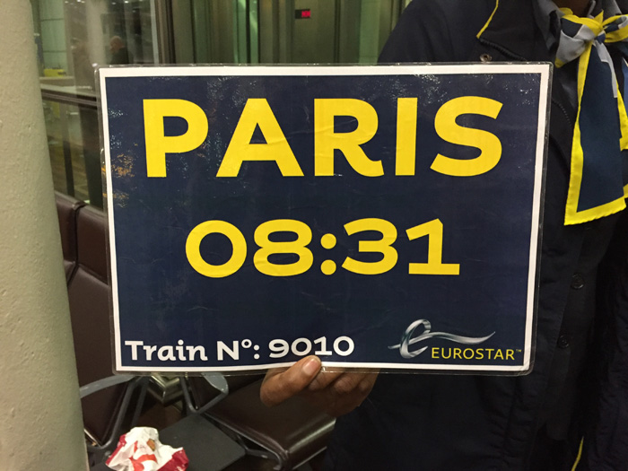
IT’S NOT OFTEN THAT A CORPORATE entity such as Eurostar gets playful with typography. But this notice on their London St Pancras platform is a splendid choice of font.
The font, called Mr Eaves, was designed in the 1990s (in Birmingham, as it happens) but perfectly captures the essence of 1940s French beer bottle labels and posters. And it does so subtly, with class and style, without going over the top.
Historical note: Mr Eaves was designed as a sans-serif companion to Mrs Eaves, a 1996 take on Baskerville that was named after Sarah Eaves, John Baskerville’s housekeeper, then mistress, then wife.


