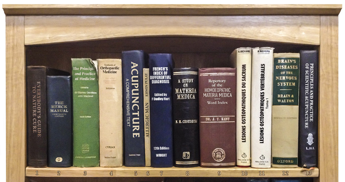
THE DESIGN OF BOOK SPINES is a largely overlooked art, as most of the effort – naturally enough – goes into the cover. But when your book is on the shelf, either at home or in the bookshop, the spine is all people will see; you have to ensure it’s visible and appealing, and that it carries all the information you want to get across.
Spines vary considerably in layout and even orientation. We’ll explore the issue of spines using, appropriately, a set of books on osteopathy, homeopathy and acupuncture. If these disciplines can’t sort your spine out between them, then you may need more serious medical intervention.
These are all hardbacks and hardbacks, traditionally, feature titles that are parallel to the ground: in other words, you can read them without turning your head, such as Everybody’s Guide to Nature Cure (1). Can’t spot it on the shelf? It’s over on the far left. The problem is that the word Everybody’s sets the maximum size for the text, and there just aren’t enough pages in the book to make the spine wide enough for it to be easily readable. This one really has to be turned 90°.
The Merck Manual is a different case: nice short words, and very few of them, which is a spine designer’s delight (2). The trouble is that this designer has got a little carried away, and has turned the title into a logo by mixing font sizes; it looks like advertising, rather than an independent book. And doesn’t that placement, a third of the way down, make you think it’s a bible?
The Principles and Practice of Medicine is bold, straightforward and clear (3). It’s a thick enough book to be able to take The Principles on one line. It also looks extremely dull: there’s nothing here to suggest that this is anything other than an earnest, stuffy textbook. If a sans font has to be used, then it should at least be one with some humanity to it – such as Gill Sans, or even Optima. Compare it with the Textbook of Orthopaedic Medicine (4), whose use of a strong serif font makes the book look much more human and approachable, but equally authoritative. The only issue with this book is the rather arbitrary spacing of all the information; it might work better if it was bunched up a little.
The decision to place the title vertically is never an easy one, as the reader has to bend their head to the side on order to make out the book’s name. In the case of Acupunture: a Comprehensive Text (5) there’s really no choice, as the word Acupuncture is too long to be clearly legible if placed horizontally. The problem here, though, is that the combination of very stylised lettering (this is set in Friz Quadrata) with very tight letter spacing makes the title especially hard to read – and in the subtitle, the letters run together so much that they form a pattern that’s very tricky to discern. A much plainer font is needed for this subtitle to be legible.
A problem of a different sort is seen in Allergic Man (6). It’s hard to see here, but it’s sandwiched between the two big blue books in the middle. The issue here is that gold embossing is all very well, but the choice of a gold-coloured cloth binding means the title is almost invisible. Contrast is everything: plain black text will work much better.
It’s hard to know what to make of French’s Index of Differential Diagnosis, with its 45° spine text (7). On the one hand, it’s certainly distinctive. On the other hand, it’s desperately ugly, hard to read, interspersed with seemingly random diagonal lines, and suggests a wacky approach to diagnosis. If this is alternative medicine, I’ll stick with the conventional kind.
A Study on Materia Medica (8) is a classically beautiful design, which could have been produced any time in the last couple of hundred years – were it not for that outsized publisher’s logo at the bottom, which spoils the effect. If you’re going to put a logo on the spine, it really needs to be more discreet, as is the case with the Repertory of the Homoeopathic Materia Medica with Word Index – now there’s a title and a half (9). While I wouldn’t normally advocate the use of italics on spines, in this case it breaks the title up into short, manageable chunks. It’s readable, authoritative and sedate, and looks like a book you can trust.
The trouble with books from most of Europe is that, like Lésions Ostéopathiques du Sacrum, you have to turn your head to the left to read the spine, as opposed to turning to the right to read vertical text on books published in the United States and the Commonwealth (10). And that’s all very well, because that’s their way. But why, when designing Lésions Ostéopathiques Vertébrales, did the publishers decide to drop half a dozen of point sizes? It’s hard to see the rationale for this disparity (11).
The aptly-authored Brain’s Diseases of the Nervous System presents a bold, no-nonsense approach (12). I’d argue, though, that five decks of title is too many to be taken in easily; but with a title such as this it’s hard to imagine how the words could be split differently. One solution is to break the text into more manageable visual chunks by taking the words “of the” down a couple of point sizes: it’s a subtle difference, but it does make it easier to read.
There are problems with Principles and Practice of Scientific Acupuncture (13). The word of overhangs the line below, as if it’s falling out of the title. In addition, the similarity of length of Principles and Scientific, and of And Practice and Acupuncture, groups these pairs together into visual chunks, making it that much harder to read the title as intended. Knocking the word of down onto the lower line would have avoided both these problems, and would have made the title much easier to read. Increasing both the point size and the leading would also help.
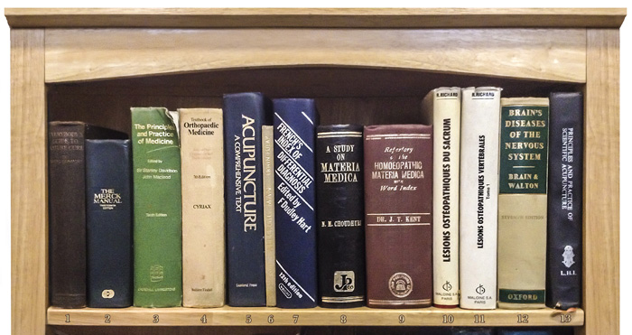
In this version of the spines image, I’ve made the changes I think are necessary in order to produce a stronger, more legible result: