
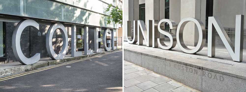
MOST CAPITAL LETTERS sit firmly on the baseline. That’s why it’s called a baseline. But letters with curved bottoms – O, S, U, C, G – drop slightly below the baseline. That’s because they would look too small if they sat on the baseline, as typographers discovered centuries ago.
The vast concrete sign that forms the curtain wall of City and Islington College has curved letters that sink into the ground: they’re truncated at their base. It’s a typographically correct solution.
Contrast this with the lettering for the trade union Unison, outside their Euston Road headquarters. They faced the same problem: but instead of sinking the letters, they raised them all up on short poles. The supports for the N and I are slightly shorter than those for U, S and O, to give all the letters the correct optical heights.
It’s not pedantry. It’s good design.