CREATING AN EFFECTIVE LAYOUT is made very much easier when you have plenty of photographs, charts or other graphics to help you liven up the design. But a lack of imagery doesn’t mean you have to create a dull layout.
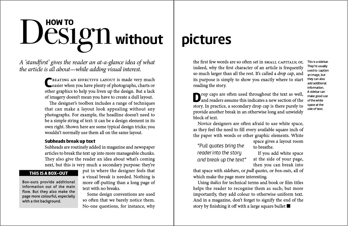
The designer’s toolbox includes a range of techniques that can make a layout look appealing without any photographs. For example, the headline doesn’t need to be a simple string of text: it can be a design element in its own right. Shown here are some typical design tricks; you wouldn’t normally use them all on the same layout.

This example uses:
Drop Caps
The first letter of a paragraph is much larger, often in a different font. It helps to draw the reader’s eye to the start of the story.
Headline
Gives the reader a clue as to what the story is about. It also adds a crucial design element by using a more decorative font than is used in the body text.
Standfirst
The paragraph of introduction that follows the headline. It provides further information not found in the headline.
Subheads
Break up the text into manageable chunks, as well as giving readers hints as to the content that follows.
Box-out
Highlights a piece of information that’s relevant to, but not necessarily part of, the main story. Its main function, however, is to add a graphic element, often by means of a tinted background.
Pull quote
A quotation from the text intended to draw the reader into the story. The fact that it breaks up long pieces of text helps to make the story easier on the eye.
Sidebar
Like a box-out, a sidebar provides additional information. Its main purpose is to allow the main text to be set narrower, letting white space into the page.
Final bullet
Often a circle or square, the bullet right at the end signifies to the reader that they’ve reached the end of the story.
