Say it with script
MULTINATIONAL SUPERMARKETS aren’t known for their humanity. So how do you make these commercial behemoths more touchy-feely? With a handwriting font, of course. Nothing says the human touch more than script. See! They really do care!
The Descent of Man
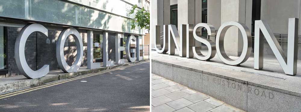
MOST CAPITAL LETTERS sit firmly on the baseline. That’s why it’s called a baseline. But letters with curved bottoms – O, S, U, C, G – drop slightly below the baseline. That’s because they would look too small if they sat on the baseline, as typographers discovered centuries ago. The vast concrete sign that forms […]
Carry on kerning
‘KERNING’ IS THE PROCESS of removing space between printed letters to produce more attractive type. It began with metal type in the 15th Century, when corners were shaved off to allow pairs of letters to sit close together. In the following example, each letter is set within its own block, as it would be if […]
The missing pilcrow
WHY DOES EVERY paragraph (after the first) in a printed book, magazine or newspaper, start with an indented space? It’s all because of pilcrows. Roman scribes used to divide their sentences with a C symbol (meaning a chapter break), adding two vertical lines to denote a new paragraph. In time these became joined together, the […]
Leading vs type size
LEADING IS THE TYPOGRAPHER’S TERM for line spacing – the space between the lines of type on the printed page. The name comes from the thin strips of lead that printers would insert between the lines of metal type in order to space them out. These lead strips were added to prevent the ascenders from one line bumping into […]
Perfect ampersands
TYPOGRAPHERS GO TO EXTREME LENGTHS to ensure that each character, each number and each element of punctuation in a typeface is in perfect harmony with all the others. Creating a typeface a complex and painstaking process. The one area where these masters of self-control allow themselves a little latitude is in the design of the […]
The perfect Eurostar font
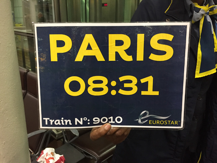
IT’S NOT OFTEN that a corporate entity such as Eurostar gets playful with typography. But this notice on their London St Pancras platform is a splendid choice of font. The font, called Mr Eaves, was designed in the 1990s (in Birmingham, as it happens) but perfectly captures the essence of 1940s French beer bottle labels […]
Perfect headline fitting
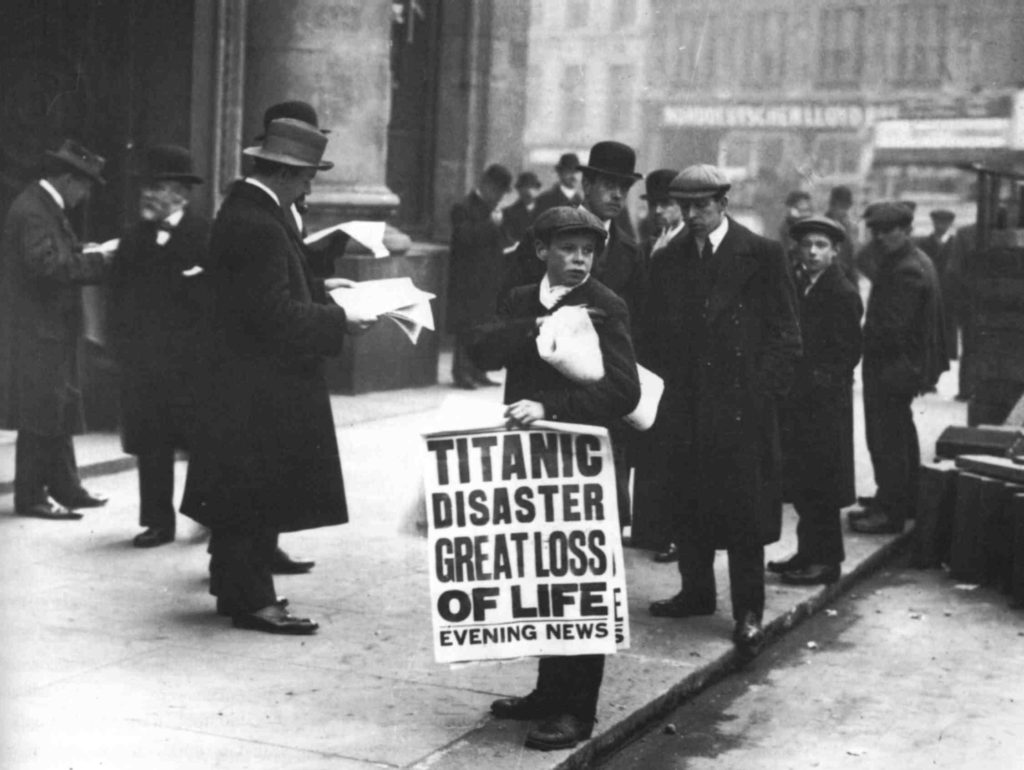
NEWSPAPER SUBEDITORS go to great lengths to make headlines fit the page. This isn’t a recent innovation – it’s been happening since the beginning of commercial printing. This poster board from the Evening News of 1911 features four decks of headline, all exactly the same width. OK, it’s not perfect from a typographic point of […]
Font frenzy

THIS IS HOW I imagine it went… – So I’ve found this really funky font for ‘Festival’. It’s called Handel Gothic, which sounds really trad, but it’s really super cool. And I’ve got this awesome Illustrator brush, let’s build a big swirl that goes round the F and through all the letters. – That’s mega! […]
Black or white?
YOU MIGHT THINK that headlines are more legible in black. But when placed on an image, you’d be wrong. Even when placed on a light background, such as the sky and clouds seen here, the black headline looks muddy and hard to read.White headlines are almost always far more legible on top of photographs, even when the […]
Serif or sans?
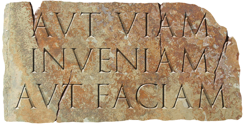
SERIFS ARE THE SHORT STROKES on the ends of letters that guide the eye along the line. They originated with Roman stonemasons, who carved them at the top and bottom of letters before carving the letters themeselves, to prevent the deeper strokes from splitting the stone. “Sans serif” letters are simply those bereft of serifs, […]
Upper or lower case?
THE TYPOGRAPHIC TERMS “upper case” and “lower case” refer to the wooden boxes in which typesetters stored the individual letters. Today, these terms are used describe capital and small letters. Beginners will frequently use upper case lettering for posters because they think it stands out more. This is rarely the case: UPPER CASE TEXT IS USUALLY HARDER TO […]