Form and function
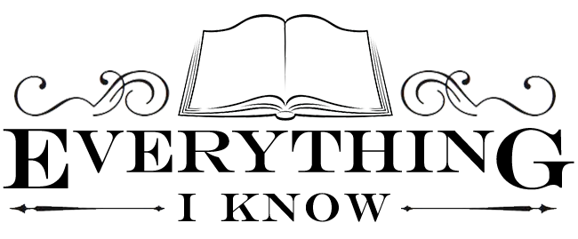
TWO BICYCLES: the first is from 1888, the second a top-of-the-range racing bike from 2025. Nearly 140 years separate them, but the designs are almost identical. Bicycles went through many iterations, from scoot-along hobby cycles to ungainly penny farthings. But once this format was arrived at, it stuck. Two wheels around two feet in diameter, […]
Lorem Ipsum
WHEN DESIGNERS are creating magazines, newspapers or even websites, we use dummy text instead of real text. The reason? We don’t want our clients to get hung up on the meaning of the words, so we give them cod Latin to represent the text that will eventually replace it. It’s called Lorem Ipsum, because that’s how […]
Read the signs
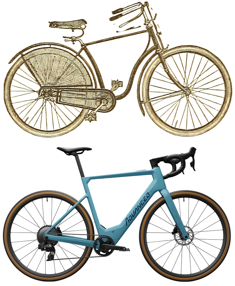
ORIGINALLY, THE NO ENTRY sign on British roads had the words NO ENTRY written in bold capitals across a white panel in the middle of the red warning circle. Clear, easy to read, hard to ignore. But any sign with writing on it demands to be read. And that meant drivers taking their eyes off […]
Three legs good
AS ANY RESTAURANT or café owner knows, four-legged tables have a tendency to wobble. That’s why you’ll see so many folded menus and beer mats propping them up. Four legs are inherently unstable, as even the slightest unevenness in the floor will prevent all four from touching the ground at the same time. Three legs […]
A duty of care
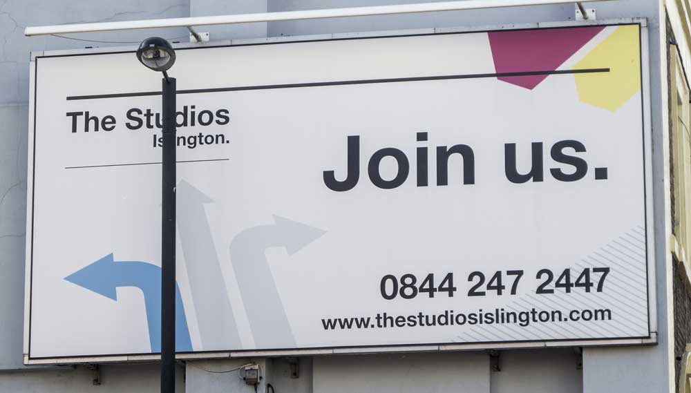
AN UNFORTUNATE SITING for a lamp post, covering up the name of the company. It could happen to anyone. Except that this poster only appeared in one place, the poster hoarding nearest to the Studios. Would it have been beyond the capability of the designer to check the site first?
Union Jack design
STRICTLY SPEAKING it’s the Union Flag. The Jack is only properly applied when it’s flown on a ship. It’s one of the more complex flags, and it’s notoriously hard to draw. Here’s how it came about. 1 The St George’s Cross is the flag of England. 2 The Saltire is the flag of Scotland. 3 Put […]
The genius of A4
IN AMERICA, they use US Letter as their standard paper size. In Europe, we use A4. It’s not just a matter of national preference: A4 – 297 x 210 mm – is, by any reckoning, a much better size. Why? Because if you fold a sheet of A4 in half, you get a sheet of […]
Use the taps

I FIRST CAME ACROSS THIS WATER COOLER at the BBC radio headquarters in London. It features two buttons, an LCD screen, and two taps. When you press one of the button, a message appears on the screen telling you to press the taps. As far as I could tell neither the buttons nor the screen had any […]
Electrical, & Co

MUCH AS I’D LIKE to admire the logo for electrical contractor Mitchell & Co – after all, it’s not often an independent electrician goes to the trouble of creating his own logo – I can’t help feeling that this is trying just that bit too hard. It’s a cute idea, and it very nearly works. […]
Passing off

IT’S TECHNICALLY ILLEGAL to try to copy a commercial rival’s design in such a way that it will tend to confuse the buying public, leading them to associate your brand with theirs and enticing them into making the wrong purchase. It’s known as passing off, and it’s not only frowned upon, it’s against the law. […]
Telefonica innovates

TELEFONICA, LIKE MOST mobile phone providers, isn’t known for its innovation in design. But look at the way these two simple words have been set, each letter casting a shadow on the one that follows. It’s enticing, it’s novel, and it draws you in, in a way that plain text wouldn’t. I’ve never seen this […]
Kindle formatting

WHEN YOU BUY A PRINTED BOOK, you can reasonably expect it to be professionally laid out, with due care and attention to avoid unsightly widows and orphans. With digital publishing, it seems those considerations go out of the window. How much effort would it have taken to avoid this stupid cockup?
Things that go up at the end
THINGS THAT GO UP AT THE END have more power and dynamism. It’s a rule that applies to music, film editing, graphics, and company names. If a film editor is cutting a piece of film of someone on a swing, for instance, they’ll almost always cut away when the swinger is at the top of the swing, […]
Admire the Vue?

VUE CINEMAS ARE GREAT. Big, comfortable seats, great projection, plenty of leg room. But their booking system – until recently – was pig ugly. Book using their app and you have to put your card in the machine to pick up your tickets, and this is the screen you get. Whoever designed the interface for […]
Straighten your spine
THE DESIGN OF BOOK SPINES is a largely overlooked art, as most of the effort – naturally enough – goes into the cover. But when your book is on the shelf, either at home or in the bookshop, the spine is all people will see; you have to ensure it’s visible and appealing, and that […]
Stories with pictures
EVERY PICTURE TELLS A STORY. And, whether you’re giving good or bad news, every story must have a picture. The design of the BBC News app takes the form of a grid of images, which means that each feature has to be supported by an introductory photograph. But if you’re a hard-pressed sub editor on […]
Tequilicious!
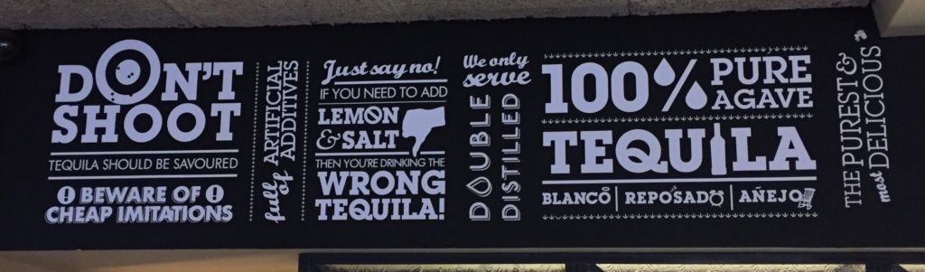
A BEAUTIFUL NOTICEBOARD in Wahaca Mexican restaurant. It’s full of great detail – note the target in Don’t Shoot, the cancel sign in Lemon, the drips in 100%, the bottle in Tequila – yet the approach is defiantly typographic. Remember, the designer started with nothing but a list of phrases. To have the imagination to turn a dull set of […]
Information overload 2

I SPOTTED THIS SIGN in a car park in Great Yarmouth. Well, yes, it certainly comprehensively covers the range of available payment options. But I can’t help thinking this information could have been got across in a rather more economical way.
Information overload 1

WHEN IS INFORMATION too much information? When the viewer is so overwhelmed by input that it’s impossible to take anything in. There may well be some vital message on this hospital notice board – after all, it does deal with the tricky issue of infection control – but you’d be hard pressed to find it […]
Design without pictures
CREATING AN EFFECTIVE LAYOUT is made very much easier when you have plenty of photographs, charts or other graphics to help you liven up the design. But a lack of imagery doesn’t mean you have to create a dull layout. The designer’s toolbox includes a range of techniques that can make a layout look appealing […]
Printer’s jargon
WHETHER IT’S A SIMPLE FLYER or a multi-page magazine, at some point you’re going to have to deal with a printer. Every word of jargon you use will knock a bit more off the quote, and that’s because they’ll be more confident that the file you give them will actually be printable to your specification. […]
Caution: design ahead
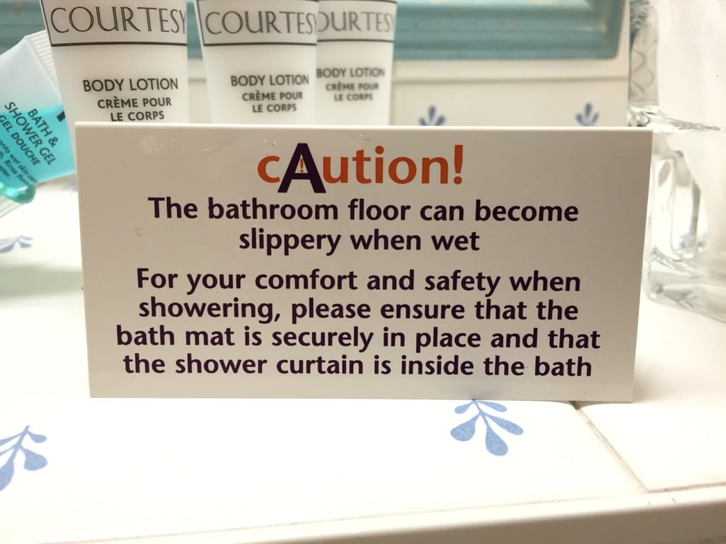
IT TOOK ME A WHILE TO FIGURE OUT why the designer of this sign in a Shrewsbury hotel chose to set the A in ‘caution’ in upper case, at a larger size, and in a different colour. Look closely: there’s a tiny red exclamation mark inside the A. Get it? It’s intended to resemble one of […]
Patient disservices

THESE TWO NOTICES appear on adjacent walls in University College Hospital. Both say the same thing. Note how the amateur version goes to great lengths to try to make the text stand out: it’s set in capitals plus bold plus underline, all in an attempt to create extra emphasis. But if it’s the only text on the […]
Flushing in style
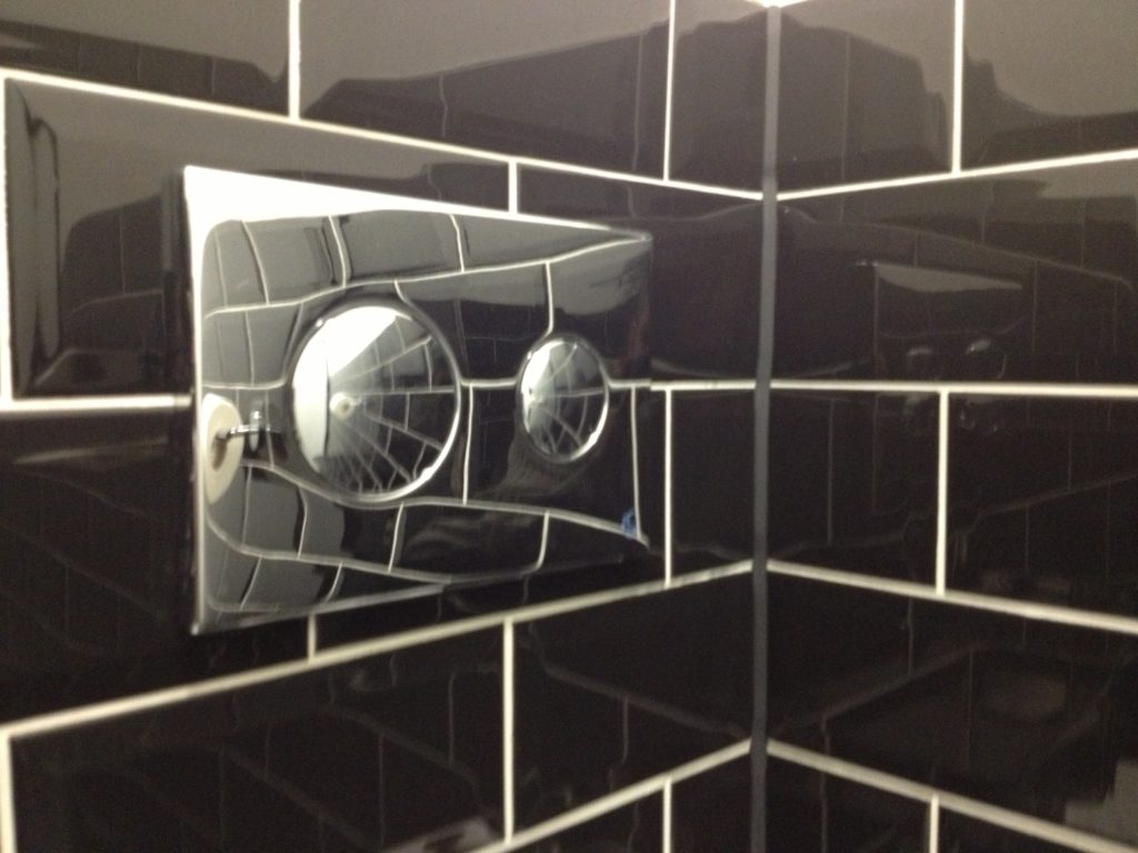
CAN A LAVATORY FLUSH ever be beautiful? Yes, when it’s as elegantly understated as this one. No words are needed: the large and small buttons express their purpose without text, and so without any coy euphemisms. Compare the simplicity and sophistication of that flush with this awkward mishmash on Brittany Ferries. The button should be obvious […]