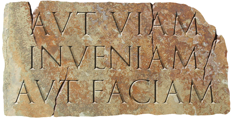
SERIFS ARE THE SHORT STROKES on the ends of letters that guide the eye along the line. They originated with Roman stonemasons, who carved them at the top and bottom of letters before carving the letters themeselves, to prevent the deeper strokes from splitting the stone.
“Sans serif” letters are simply those bereft of serifs, from the Latin sans meaning without. Sans serif lettering is closer to handwriting, but didn’t appear much in printed text until the early 20th Century.
Serif fonts are easier on the eye for long passages of text, such as books and magazine articles. The body text of almost every newspaper is set in a serif font, because it’s more comfortable to read at length.
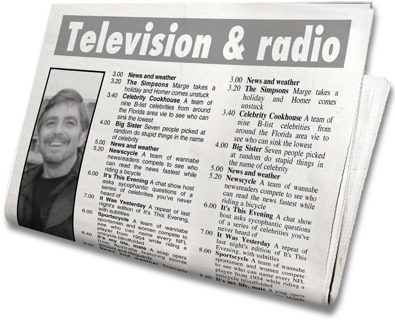
But sans serif fonts are easier to read when the text comprises small chunks of information. The image below shows how a sans serif font, used in newspaper listings, takes up less space and is more legible.