HANDS UP WHO KNOWS what a newspaper looks like. All of you? That’s great. Perhaps you could tell the graphic designers who work on films and TV shows, since most of them have clearly never seen one.
There have been many obvious gaffes – like the fact that the same prop newspaper has been seen in dozens of films and TV shows, from Power Rangers to No Country for Old Men (if you’re interested, check out all the stills here). Then there are the mistakes that only show up on freeze frame, such as this still from the 1999 TV series The Pretender. The story is about a boy and his kidney transplant – but read past the first paragraph, and you’ll see the rest of the article is about the move to impeach Bill Clinton.
What I’m interested in, though, are the errors in designing the page so it looks like a real paper. In the Pretender example, why is the first paragraph set ragged right, when the rest of the story is justified? Why is the first word of this paragraph indented, rather than full out? These are elementary issues. How is it possible for the graphic designer on this series not to have matched the style of the newly-written paragraph with the style of the rest of the article?
The headline presents another issue. The word ‘from’ (which shouldn’t have an upper case F, even in an American paper) overhangs white space beneath it. This would never happen in a real paper: subeditors go to extreme lengths to ensure that headlines are written to fill the space.
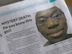
 You can see a more extreme example in this still from a recent episode of the television series Silent Witness. The designer here is mimicking a local newspaper, WFM – a curious acronym for Waltham Forest News – which, as a fortnightly council free sheet, is an odd choice of publication for an announcement of this time-sensitive kind.
But look at that headline: the word ‘girl’ sitting on a line all by itself. There isn’t a subeditor in the world who would set a headline in this way, even in a local council. The first paragraph begins with a huge indent – again, this is never done (in the real WFM, the first paragraph of each story begins with a two-line drop cap). And note the picture caption, just visible on the right of the frame. It reads: “Unidentified Person – Police are appealing to the public”. But why has this been split into two lines, when there’s room for “to the public” on the top line? Why is it aligned right, as newspaper captions never are? Even the most recent of art school graduates wouldn’t have made these elementary mistakes.
 From the same episode of Silent Witness, we see an edition of the paper from a couple of days later (the fact that the paper is fortnightly is ignored, of course). Here, the front page headline reads: “It was Murder”.
Murder? With a capital M? Why pick that word to capitalise? Is it conceivable that a newspaper subeditor would ever set a headline in this way? Of course not. You know it, and I know it. The only mystery is why the designer responsible didn’t know it. And consider the subhead: “Expert exposed police blunder”. Every newspaper today would use the present tense, “Expert exposes police blunder”, to make the story seem more current.
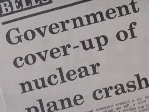
 Sometimes the designer will make every effort to match a newspaper’s look and feel, copying the typeface and layout, but will still get it wrong. This example is from the 1986 film Defence of the Realm. It’s purporting to be a headline from The Guardian, and reads “Government cover-up of nuclear plane crash”. As headlines go, it’s hardly arresting; but again, we see the word ‘nuclear’ on a line by itself, barely filling two thirds of the width of the double column.
In real life, a major part of the subeditor’s art is carefully crafting headlines to fill the space as tightly as possible – especially on a design-led paper such as The Guardian. Take a look at today’s edition of any mainstream newspaper, and you’ll see the lengths the headline writers have gone to: not an inch of space is wasted. White space is never seen.
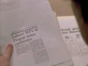
 A headline such as this second example from Defence of the Realm would never appear, not only because of the triangle of space on the right, but because the apostrophe in MP’s is amateurish and unacceptable (the Guardian Style Guide is very clear on this point).
Does it matter? Is it only nitpicking designers like myself who are going to notice these errors? Well, these newspaper mockups are put together by designers, so in that respect it does matter. They should, frankly, be better at designing.

