IT TOOK ME A WHILE TO FIGURE OUT why the designer of this sign in a Shrewsbury hotel chose to set the A in ‘caution’ in upper case, at a larger size, and in a different colour.
Look closely: there’s a tiny red exclamation mark inside the A. Get it? It’s intended to resemble one of those temporary plastic signs supermarkets put up when someone’s broken a bottle of ketchup. Or perhaps a road sign. Or something.
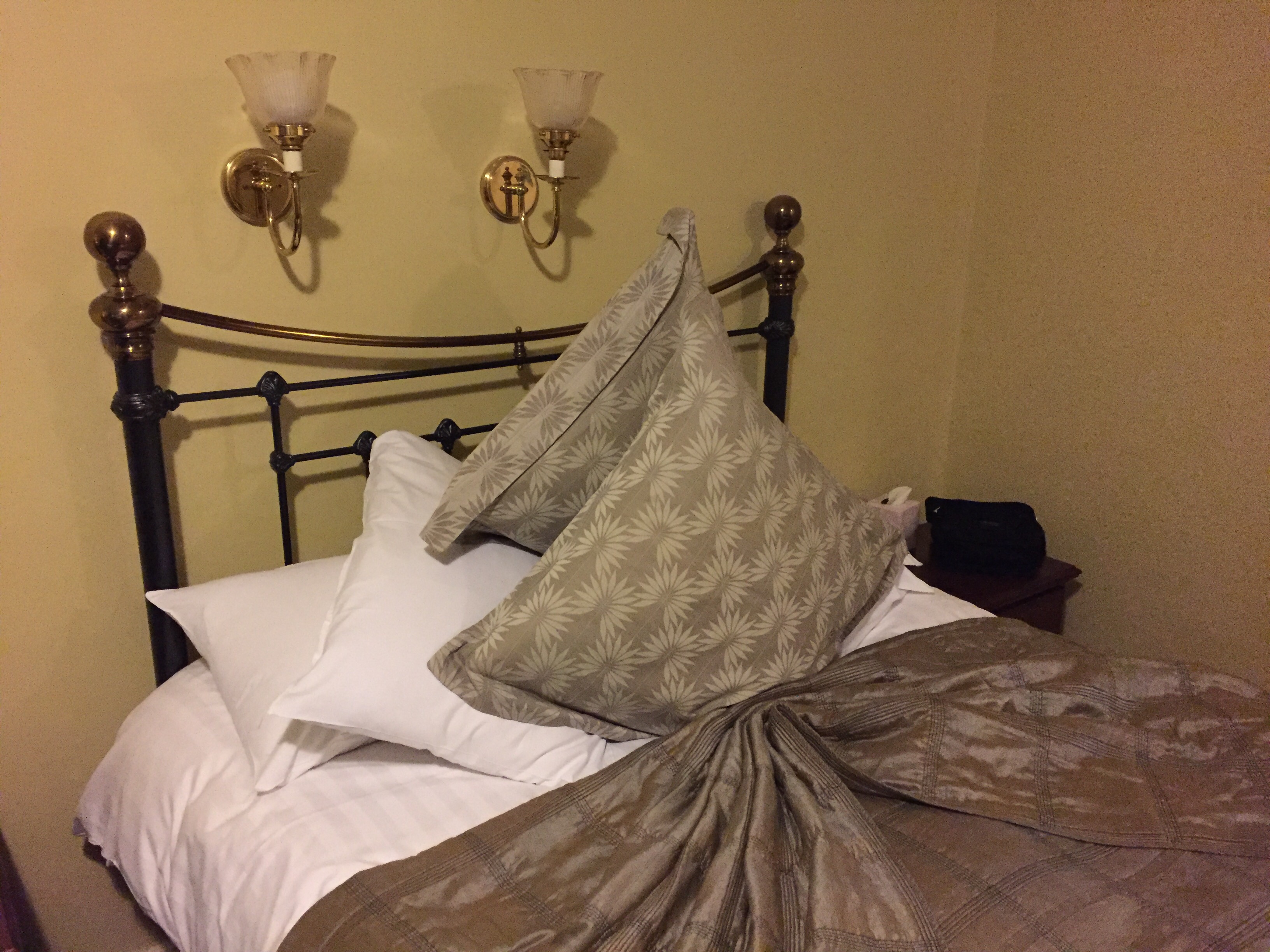
The hotel clearly prides itself on its design flair. Here’s how they arrange the pillows: